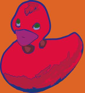
Here I did changing a photo into a pictureograph. In this case I changed a photo of a rubber ducky into what u see to the left. In photoshop I used the magic wand tool and selected parts of the duck and made them into paths. Then I exported these paths into Illustrator. There I divided the paths in the path funder box and then ungrouped them. Then all I had to do was colour the gaps and I did so.
So, what do u think of my ducky?
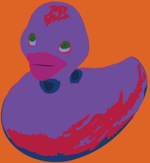
No, don't like these colours...
Then what about this one, I have changed the colours and given my ducky a blue outline.
Now I have my ducky I turned him into a symbol so I can use him when ever I want. I did this by clicking the symbol tab and then new symbol, and there u go.
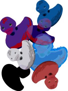
Here I have used my ducky symbol, I clicked the symbol spray tool and clicked my ducky and sprayed some on to a page. Then I used the other symbol tools to chnage them.
I used the symbol sizer ont eh purple duck which made him bigger.
Then symbol shifter which just moves them slightly.
Symbol scruncher to move them closer together.
Symbol spinner to change the angle of some of them.
Symbol stainer which changes the colour, as u can see one duck has gone red, one blue and one grey.
Symbol styler also changes the colour but with graphics not just couolor like the light blue duck.
Then lastly I used the symbol screening which makes the ducks fade so things behind it come through like on the small purple duck u can see the blue duck coming thorugh it.
I really like my ducky's I think they are really cool and look really groovey. They are a similiar style to Andy Warhols work, which I like.

 Above are the two images that I have blended below.
 Above is colour burn.
 Above is colour dodge.
 Above is hard mix.
 Above is overlay style


 Here I have used my ducky symbol, I clicked the symbol spray tool and clicked my ducky and sprayed some on to a page. Then I used the other symbol tools to chnage them.