Monday, November 07, 2005

Land Artist - Andy Goldsworthy


Land Artist - Robert Smithson


Robert Smithson's Spiral Jetty (1970)
Location: Great Salt Lake, Utah.
Materials: local black basalt rocks and earth.
Dimensions: 1500 feet long, 15 feet wide

Land Art


Links - Jasper Johns And Jamie Reid

Jamie Reid (born 1947) is a British artist and anarchist with connections to the situationist movement. His work, featuring letters cut from newspaper headlines in the style of a ransom note came close to defining the image of punk rock, particularly in the UK.


Johns, Jasper (1930-), American painter, sculptor, and printmaker, who has played a leading role in the development of mid-20th-century American art.


Tuesday, October 25, 2005

Blending Technique


Above are the two images that I have blended below.

Here is my two images blended and my text mask I did.

Blending Technique - Adjustments

Above is colour burn.
Above is colour dodge.
Above is hard mix.
Above is overlay style

Tuesday, October 04, 2005

Retouch Techniques on Dragon Picture

Using the different tools on photoshop I have changed each corner of the pic below. I have written on each corner the tool I have used.
Before


After


In this pic I think I like the Blur and Burn effect best, as the burn makes it really dark and gives it a bit more depth as it is a dragon pic, and the blur distorts it, which makes it look sort of dreamy.

Ducky


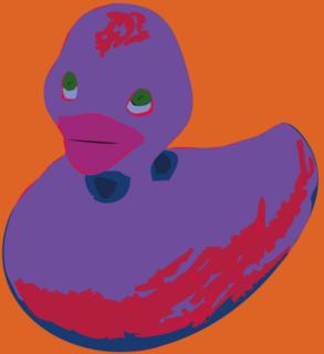
Here I did changing a photo into a pictureograph. In this case I changed a photo of a rubber ducky into what u see to the left. In photoshop I used the magic wand tool and selected parts of the duck and made them into paths. Then I exported these paths into Illustrator. There I divided the paths in the path funder box and then ungrouped them. Then all I had to do was colour the gaps and I did so.
So, what do u think of my ducky?

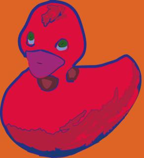
No, don't like these colours...


Then what about this one, I have changed the colours and given my ducky a blue outline.

Now I have my ducky I turned him into a symbol so I can use him when ever I want. I did this by clicking the symbol tab and then new symbol, and there u go.


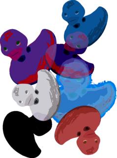
Here I have used my ducky symbol, I clicked the symbol spray tool and clicked my ducky and sprayed some on to a page. Then I used the other symbol tools to chnage them.
I used the symbol sizer ont eh purple duck which made him bigger.
Then symbol shifter which just moves them slightly.
Symbol scruncher to move them closer together.
Symbol spinner to change the angle of some of them.
Symbol stainer which changes the colour, as u can see one duck has gone red, one blue and one grey.
Symbol styler also changes the colour but with graphics not just couolor like the light blue duck.
Then lastly I used the symbol screening which makes the ducks fade so things behind it come through like on the small purple duck u can see the blue duck coming thorugh it.
I really like my ducky's I think they are really cool and look really groovey. They are a similiar style to Andy Warhols work, which I like.

Friday, September 30, 2005

Retouch Techniques on Photoshop


Here I have taken a pic and applied different effects to it by using tools from photoshop.
I have used Smudge, dodge, sponge and burn. I like the smudge best as it distorts the pic and gives a really smooth and groovey finish.

retouch old photo - before and after


As u can see this old photo is faded and scratch, so using some of photoshops tools I will try and retouch the photo.


As u can see it looks much better now. The first thing I did was adjust the levels, (Image - Adjustments - Levels) adjusting the levels lets me make the picture darker or lighter. Then to remove the scratches I used the clone stamp tool, (Alt then clickon area u want to clone, then click where u want the clone piece to go). I also used the lasso tool, I outlined an area which was undamaged and copied and pasted it onto a damaged area.
I think compared to the other photo I have done a good job, what do u think?
I must admit it did take me a while to get the hang of the tools, but I get there in the end, just hope I can remember how to use them next time!

Tuesday, September 27, 2005

Different brushes

Using different brushes on photoshop.
For each of the different brushes on each pic I changed one or more of the brush settings to get their effect.
In the top left box I used a size 19 brush, Angle 40, Roundness 4, Hardness 48, Spacing 149, Scattering 177, angle jitter 100 and smoothing on.
The top right was 58 brush, spacing 79, Jitter size 45, pen pressure, scattering on and dual brush 42.
the middle left was brush 95, Spacing 57, Jitter size 45, pen pressure on and wet edges on.
The middle right was brush 29, angle 45, roundness 56, spacing 87, Jitter size 20, fade 25, angle jitter 58, pen pressure on, smoothing on and opacity 100.
The bottom left was brush 65, roundness 12, hardness 52, spacing 151, jitter size 20, fade 25, angle jitter 58, pen pressure on and noise on.
The last one was 133 brush, angle 33, roundness 44, hardness 6, spacing 124, jitter size 10, stylus wheel, angle jitter 4, initial direction, dual brush 112, diameter 75, spacing 26, scatter 96 and count 3.
Each one with a different colour to stand out.
My favorite ones are the 3rd, 4th and 5th one because they stand out the most and I think are the most unusual.

Friday, September 23, 2005

Moods


Scan10001
Originally uploaded by Ding Ding1.

Each box has a different scene and colour to give a different mood.

For example the top right one is very dark and black whcih would symbolize sad or angry, and the clouds show that maybe it is going to rain, which is very horriable and depressing weather.

Thursday, September 22, 2005

Line Marking - Morandi


morandi-stilllife
Originally uploaded by Ding Ding1.
This piece by Morandi has been produced by using a technique called cross hatching. Morandi has paid alot of attention to detail, which makes this image stand out.

Line Marking - Henry Moore


Henry Moore uses a scribbly, sketchy type of style. I think works very well, if we look at the deer there is very little tone but looks like a lot of detail and looks very real.


Here the elephant has lots of tone in some areas and not so much in others, but using the lines and scribbables it again looks very real and full of detail, which I like very much

Tuesday, September 20, 2005

Colour - William Morris


William Morris uses lots of colour in his work, but in each piece he tends to use one very strong colour and then black or white. As u can see here the dark green with black, or the orange with white. By just using two colours he has achived some really beatitful pieces. Also have notice that his work are pattrens like u would find on material, they are very decortive and pretty. I think I like the light green one because not only has he done flowers like in all his other ones he has included rabbits and birds which give it that extra touch.

Colour wheels on Illustrator


I created these colour wheels in Illustrator, by creating a circle and then divided it into sergaments by using lines and then to make then centeral I used the align tool and then divided the pieces up so I could colour each piece.
My second colour wheel I have added more colours, to do this I had to find the colour in between. So for example - To find red/orange, I took the red's CMYK percentage and the oranges percentages and found the middle numbers and got the colour in between.
Also I have each colour going darker, to do this I just added more circles and increased the percentage of black (K) each time I went in to the circle.

Thursday, September 15, 2005

Perspective - M C Escher


A perspective image by M C Escher.
Escher is one of my favourite artists,
I love this one because it is so unusal,
it has been twisted to give a really good effect,
but it is still in one point perspective and has
lots of detail which makes it interesting.

Perspective - David Hockney


David Hockney is a photographer and artist. This piece is a college of photos of an image in one point perspective.
I like the way it looks sur-real and has very bright colours.

Tuesday, September 13, 2005

Perspective


One point Perspective - An image in this sort of perspective will show all lines going off into one point into the distance. As shown by the image to the left which I found in a mag.

Two point perspective - this sort of image will have the lines going off in two directions, like in the image to the right.


Three point perspective is more harder, this time the lines go off in three directions like this.